Today, having a mobile-friendly website is crucial for Australian small businesses aiming to enhance client engagement and grow their customer base. As more consumers use smartphones and tablets to access online content, ensuring your website is optimised for mobile devices is essential for providing a positive user experience and increasing enquiry potential. Here we explore what makes a website mobile-friendly, what components it should include, and how small business owners can enhance their website’s mobile performance.

What is mobile-friendly website and why it matters
A mobile-friendly website is designed to function smoothly on smartphones and tablets, ensuring that content displays correctly regardless of the device. Unlike traditional websites, which may only look appealing on desktop computers, mobile-friendly websites adapt to smaller screens without losing functionality. This adaptation is crucial as neglecting mobile optimisation can lead to lost business opportunities in an era where more clients browse on their phones.
For example, a café in Melbourne that optimises its website for mobile use can attract more customers who search for dining options on their phones. This means that small businesses that prioritise mobile-friendly design can gain a competitive advantage by reaching a wider audience and enhancing their customer engagement.
For those looking to improve their online presence, tools such as a website builder for small business can simplify the transition to a mobile-optimised design.
What does a mobile-friendly website include?
Several components are essential for a mobile-friendly website, each contributing to an enhanced mobile user experience. Responsive design is at the heart of this process, allowing the website to adjust dynamically across various devices. This feature is crucial as it contributes significantly to the user’s experience by maintaining consistency across platforms. Additionally, readable typography is vital as it ensures that text is legible on smaller screens without requiring users to zoom in or scroll excessively.
Tap-friendly navigation is another critical component. This involves designing buttons and links that are adequately spaced and easy to interact with using touchscreens. Fast mobile pages are essential for user satisfaction and search engine rankings. For example, a retail store in Sydney with fast-loading mobile pages can retain visitors, reducing bounce rates and increasing potential enquiries.
This means that by focusing on these key components, small businesses can significantly enhance their website’s mobile performance, leading to increased customer engagement and enquiry potential.
Can you get mobile results without a full rebuild?
A common assumption among small business owners is that quick fixes or minor updates will be sufficient to make their websites mobile-friendly. While these might seem appealing, they often fall short in delivering comprehensive results. Properly addressing issues like structure and usability requires more than superficial changes. However, there are ways to make gradual improvements without undertaking a complete rebuild.
Focusing on key areas such as page speed, navigation and layout can lead to notable enhancements over time. For instance, a local service business in Brisbane can improve its website’s mobile friendliness by optimising images and refining the layout for better usability. This means that for sustained improvements, ongoing attention to these aspects is necessary.
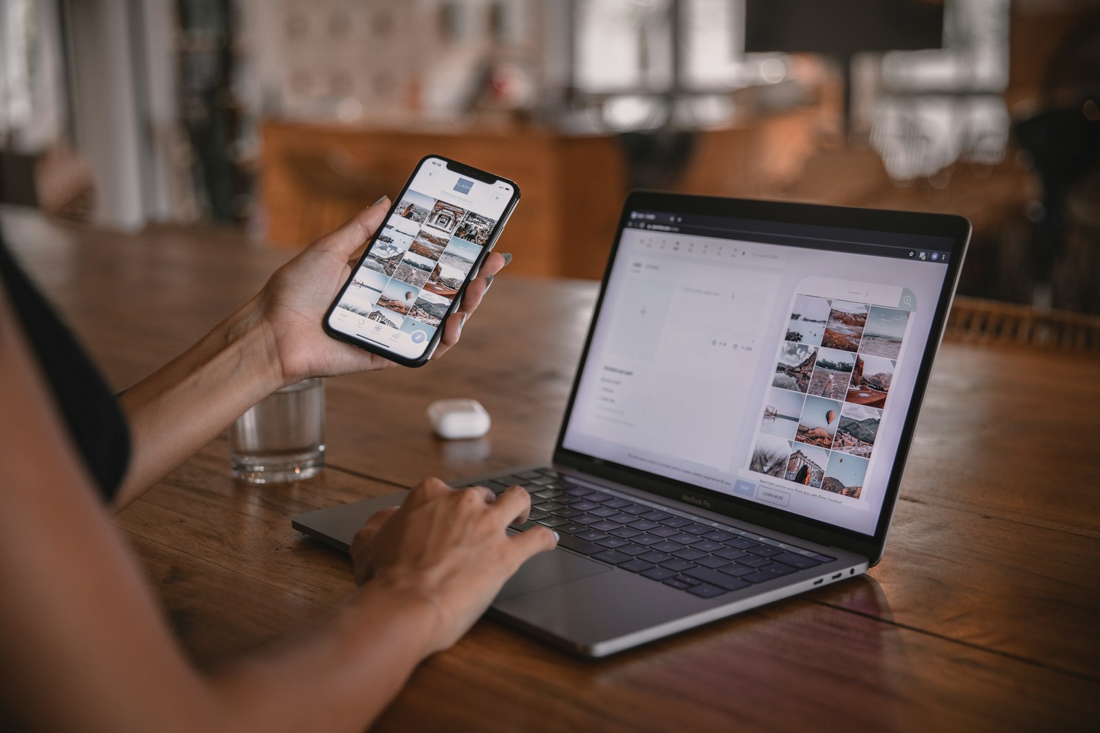
For those seeking professional guidance, the Small Business Website approach and experience offers valuable insights into effective mobile optimisation strategies.
How to improve mobile friendliness for your small business website
Improving the mobile friendliness of your website involves a series of strategic steps. The first step is conducting a quick audit of current performance metrics. Identifying areas such as loading speed issues or navigation challenges provides clarity on where improvements are needed most. Next, consider making page-level adjustments like optimising images or refining the layout for better usability.
Finally, implementing site-wide changes – possibly with professional support – will ensure comprehensive enhancements that benefit your business long-term. For example, a professional services firm in Perth could see improved client engagement by investing in a full-scale mobile optimisation strategy. The importance of responsive design remains central throughout this process as it underpins user experience across all devices.
Frequently asked questions
What is mobile-friendly website?
A mobile-friendly website is one that has been designed or adapted to display correctly on smartphones and tablets, providing an optimal viewing experience across all devices.
How can mobile user experience affect leads?
The user experience on mobile devices directly affects customer engagement and enquiry rates; a positive experience can lead to higher conversion rates while frustrating navigation may cause potential clients to leave.
Is responsive design the same as mobile-friendly?
Responsive design is a crucial part of making a website mobile-friendly but focuses specifically on ensuring the design adjusts smoothly across various screen sizes and orientations.
More about our approach to mobile-friendly website design
The significance of having a mobile-friendly website for small businesses lies in enhancing client engagement and increasing enquiry potential. Small Business Website specialises in building tailored digital solutions with over 20 years of experience supporting Australian businesses from its Sydney studio. If you’re ready to enhance your online presence, Optimise your website for mobile users.